

ROLL CALL 2026
SHANEL
DIGITAL ANIMAL
Proposed Work: Life Cycle (Wall Print + Process Drop)
1. The Manifesto: Graphic Punk Rock
My work is a reflection of how a lot of us feel right now: overloaded with data, bombarded by constant visual noise, and looking for something real we can actually hold in our hands.
It’s got the energy of a loud punk sticker slapped onto a stop sign. It aims for an instant, aggressive visual impact rather than trying to invent some deep, original philosophy.
We live in a world of constant noise and short attention spans, and my work definitely reflects that.

2. The Concept:
The Frozen Impact (Control vs. Chaos)
For Roll Call 2.0, the proposed piece Life Cycle perfectly captures my obsession with dualism and high contrast.
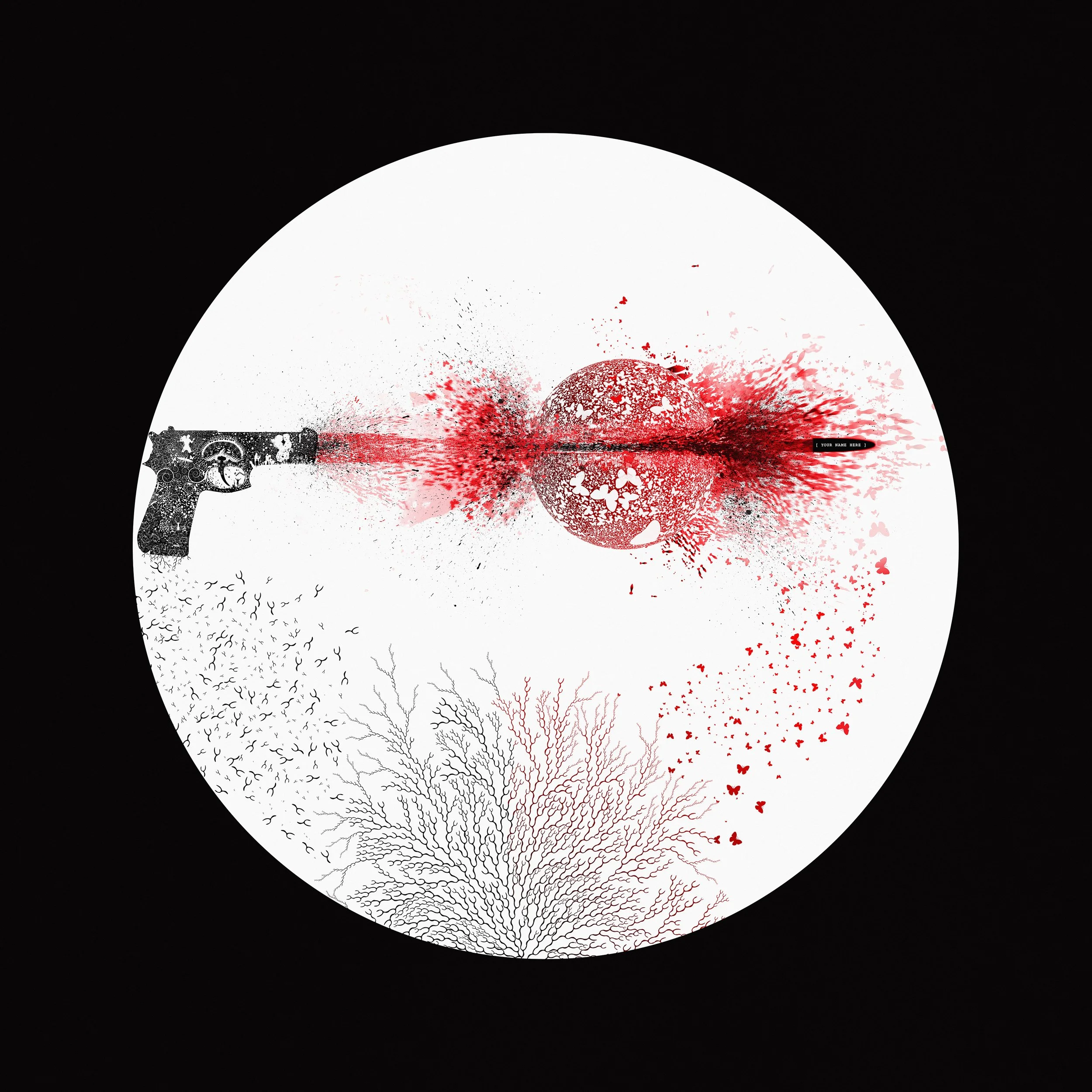
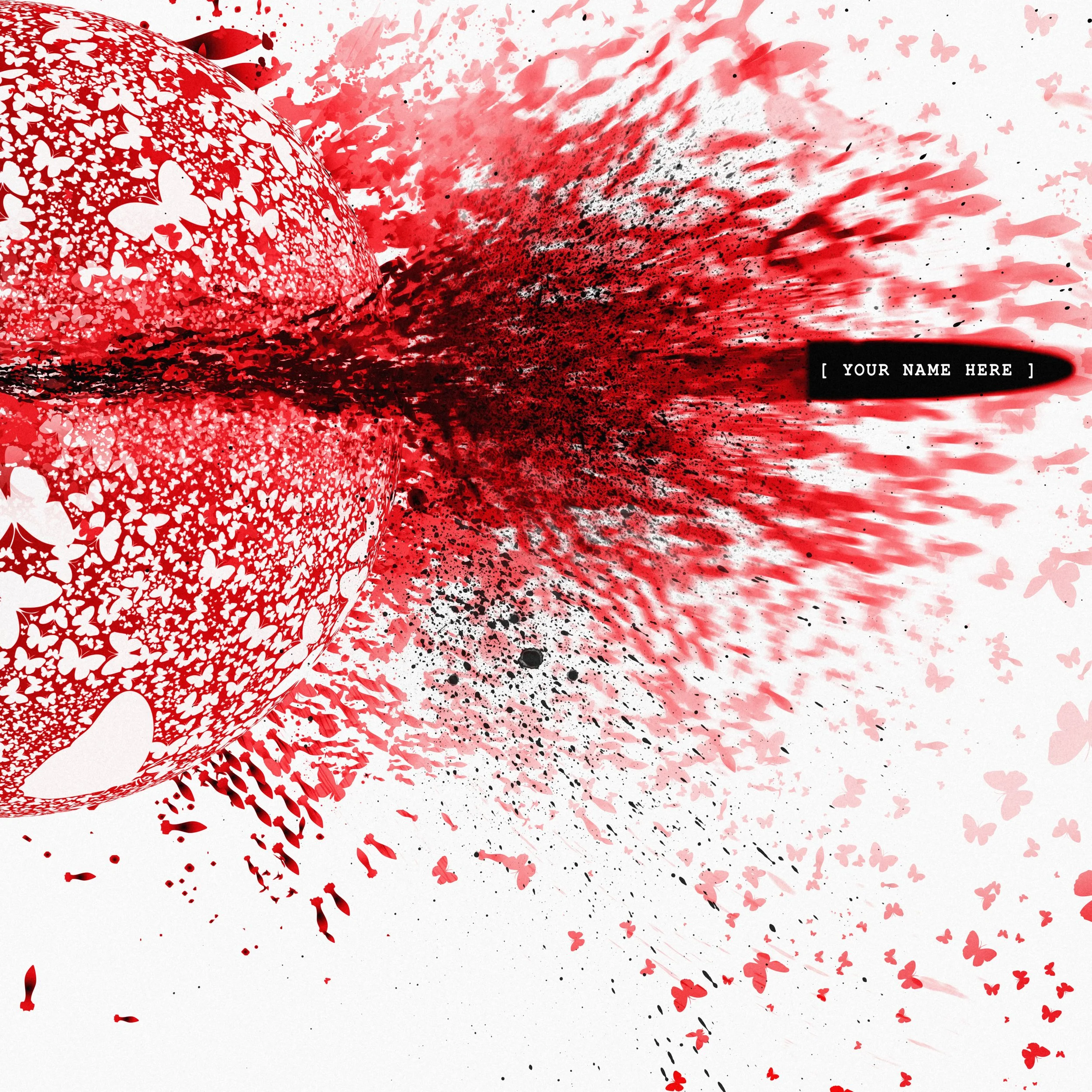
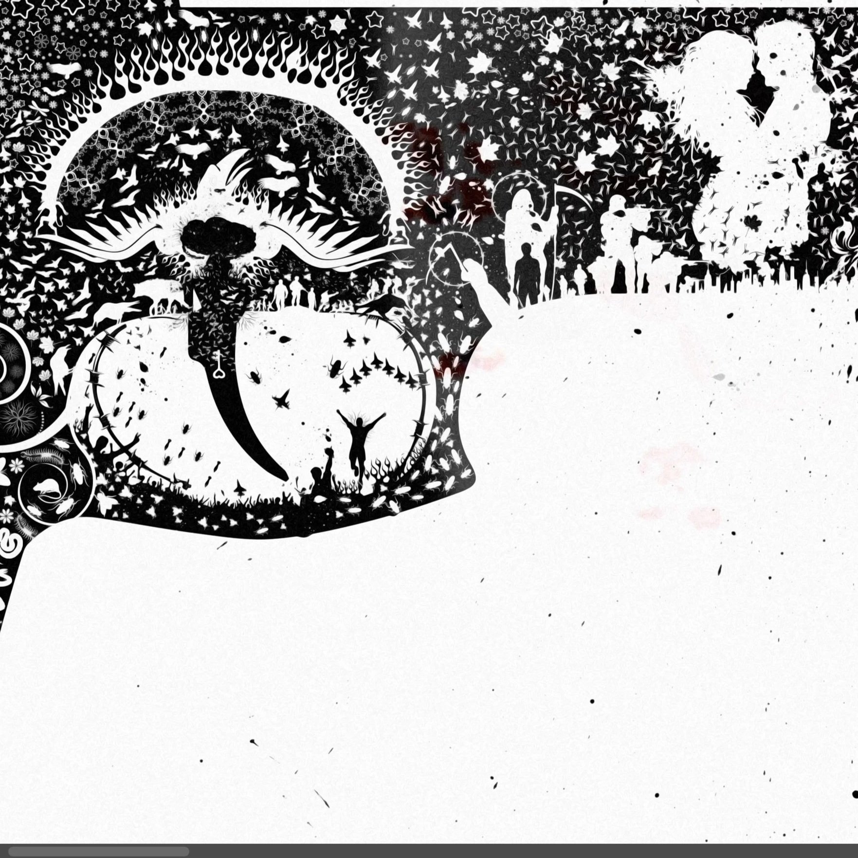
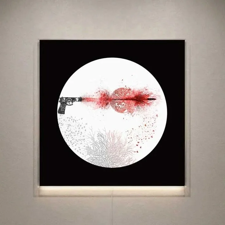
The picture focuses on a detailed digital illustration of a handgun on the left. The surface of the gun is covered in intricate sketches and patterns styled like street-art notebook drawings.
It’s a balancing act of high contrast, and it's meant to make people want to stare at it for five minutes just to see half of what's actually hiding in the detail.
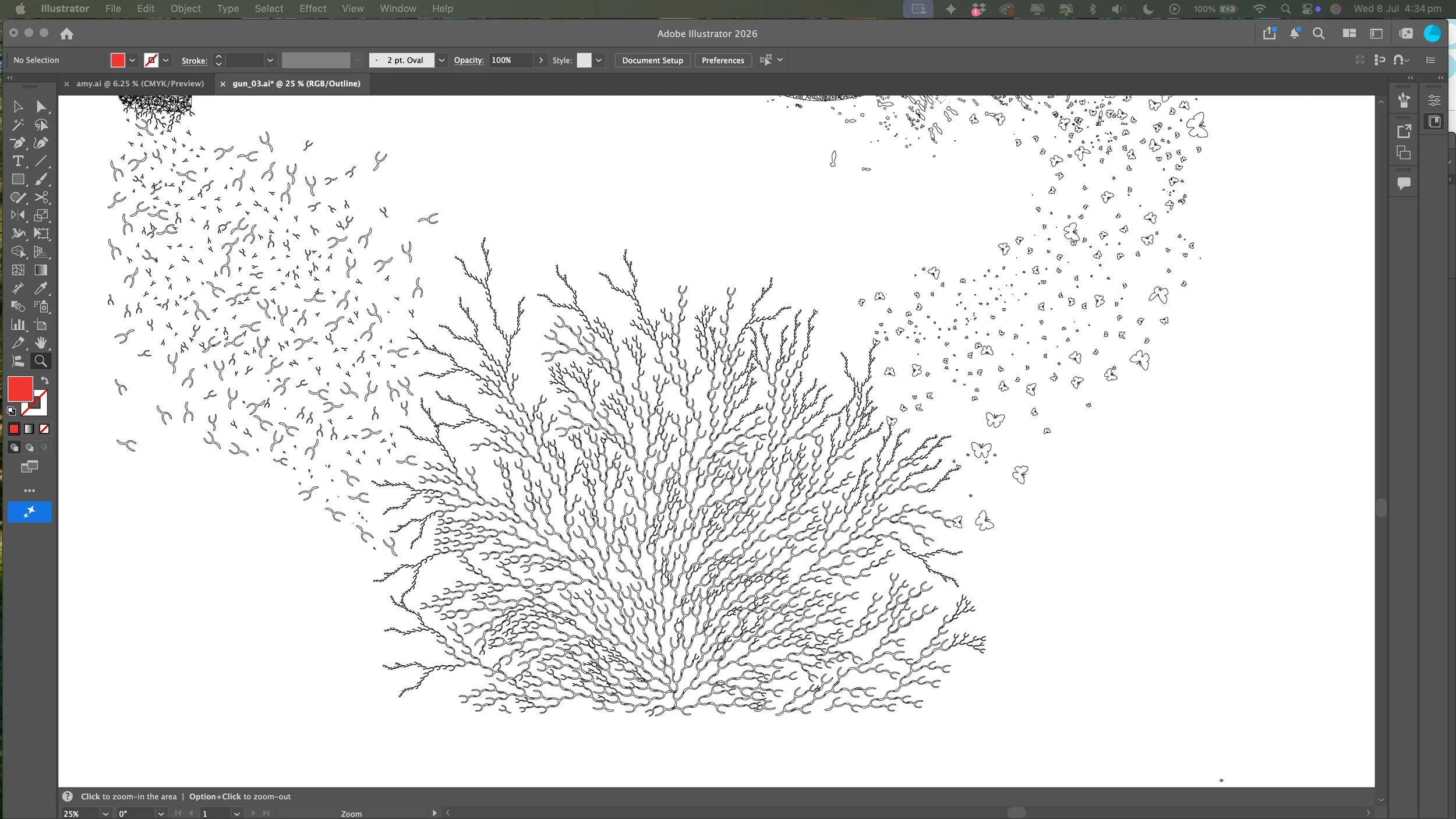
I have a massive fixation on urban decay, the unpredictable texture of concrete, and the "happy accidents" of a spray can—the drips, the overspray, and the random splatter.
This piece takes that raw street energy and chaotic grit, freezing it frame-by-frame, and documents the destruction pixel by pixel.
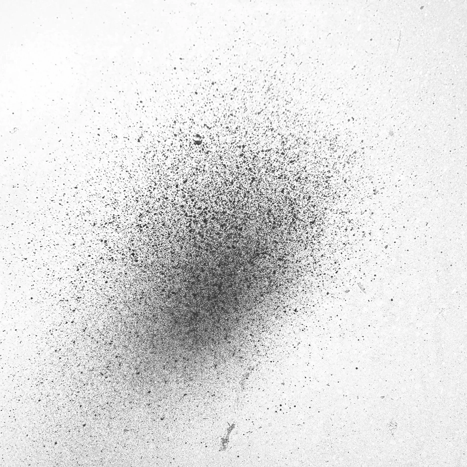
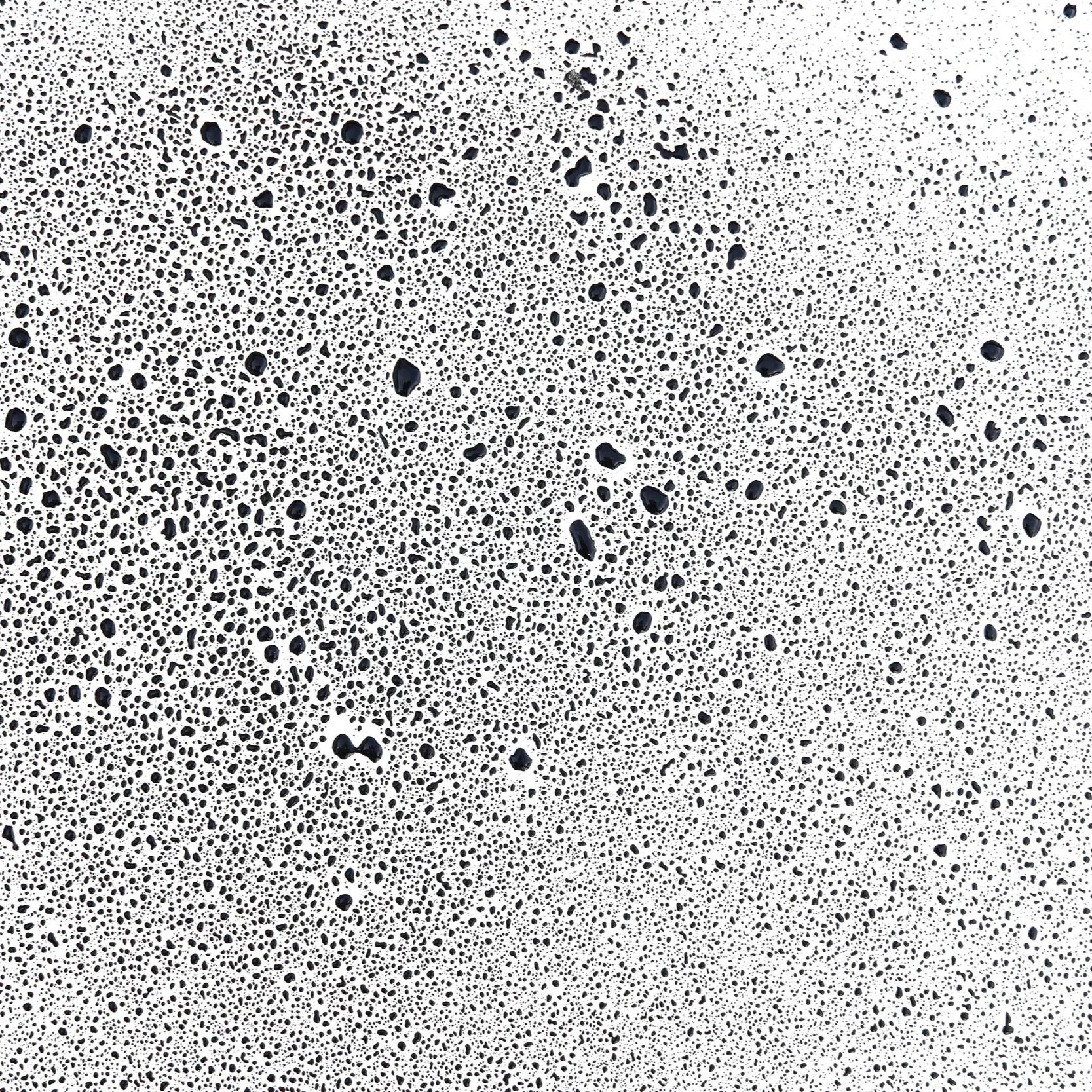
The piece centers on a highly detailed illustration of a handgun on the left, its entire surface mapped out with a dense web of custom sketches and raw patterns.
Moving across the frame, a bullet violently tears through a massive, circular cluster made of thousands of tiny butterflies.
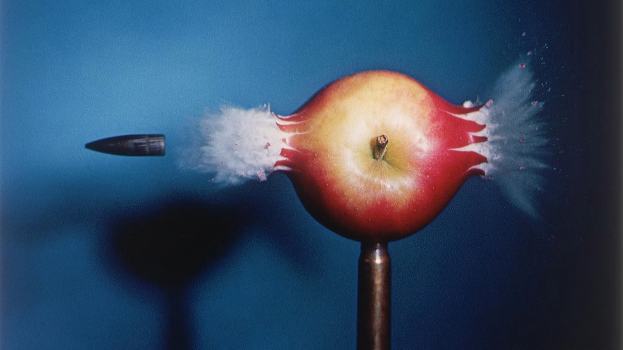
I wanted to capture that exact, explosive millisecond of impact and freeze the entire transition right in mid-air just like Harold Edgerton’s famous high-speed photo of a bullet shattering an apple.
Rejecting the Digital Grid
At its core, this work is born from a fascination with making the digital medium behave like a living, breathing entity.
I use the everyday visual noise of our internet culture as my building blocks.
The process for me is all about the curation, the density, and how everything is structured. It includes sourcing raw textures, making ink splatters, spraying marks, and photographing
real-world paint stains.
There is something really satisfying about watching a giant, chaotic mess of tiny elements perfectly lock together to form a clean, cohesive silhouette.
It's like watching a puzzle click into place.
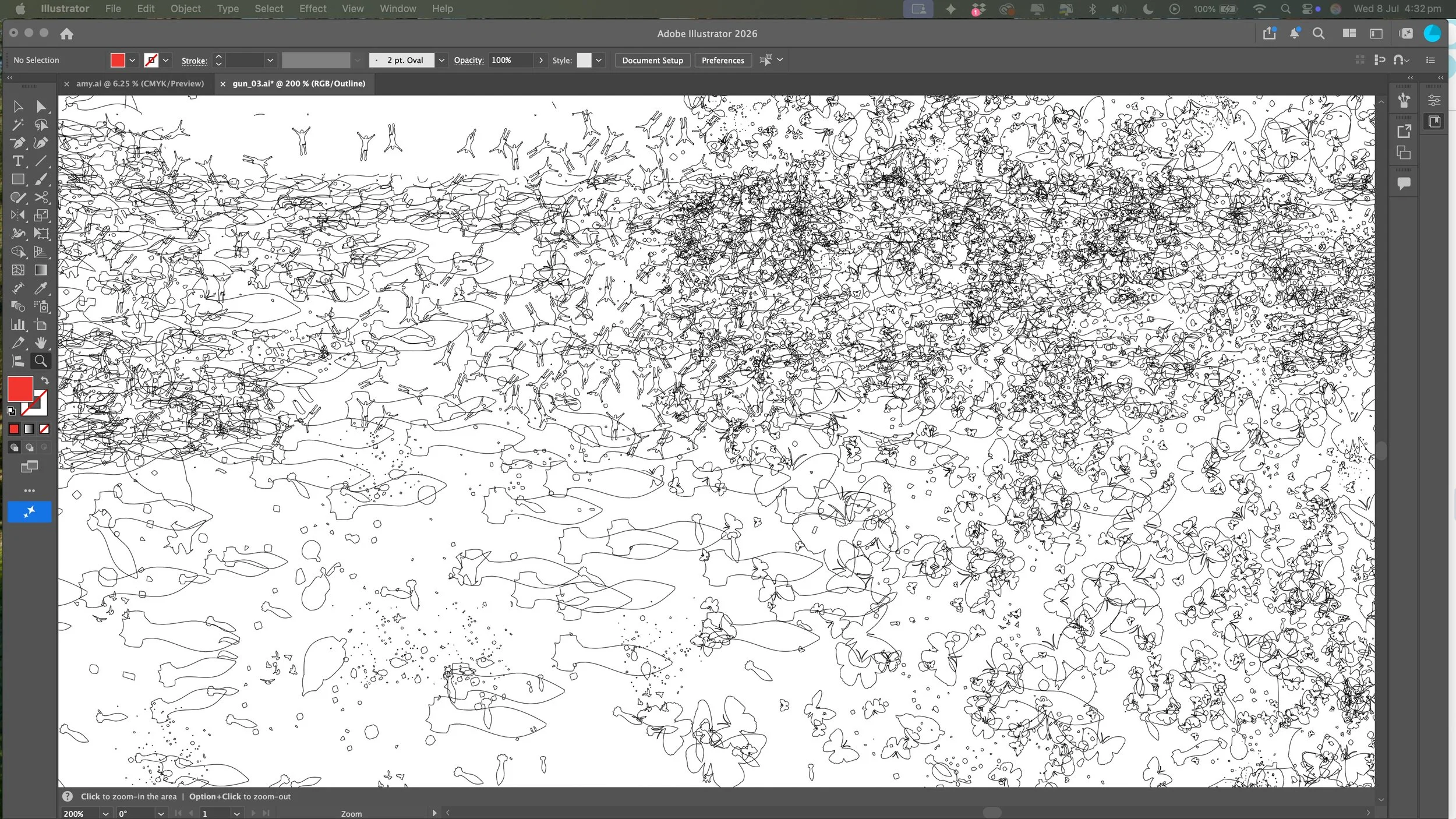
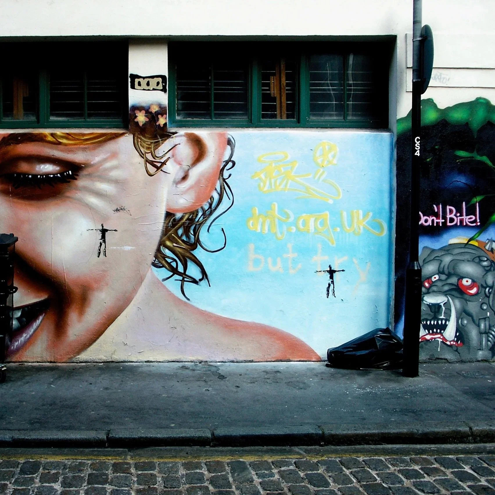
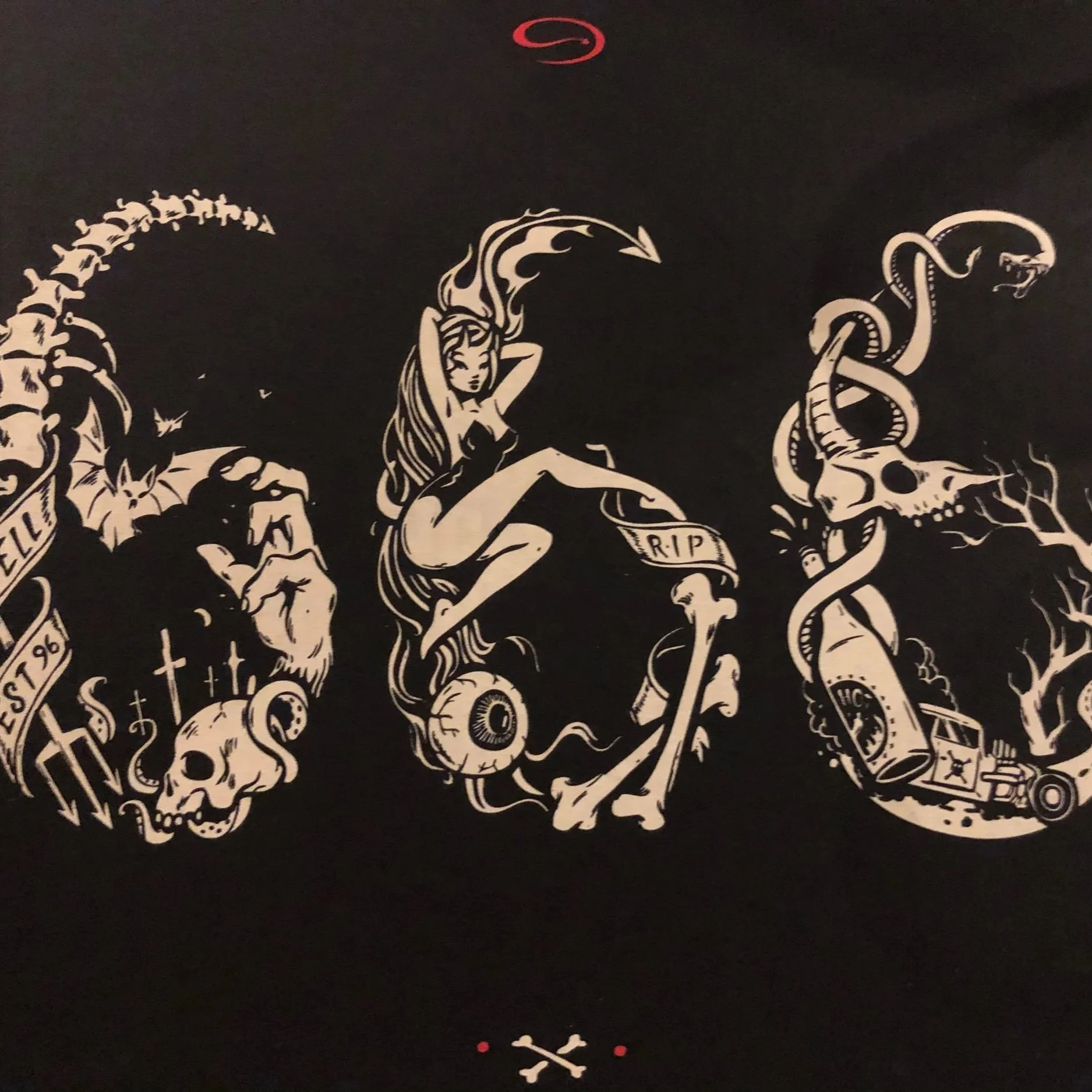
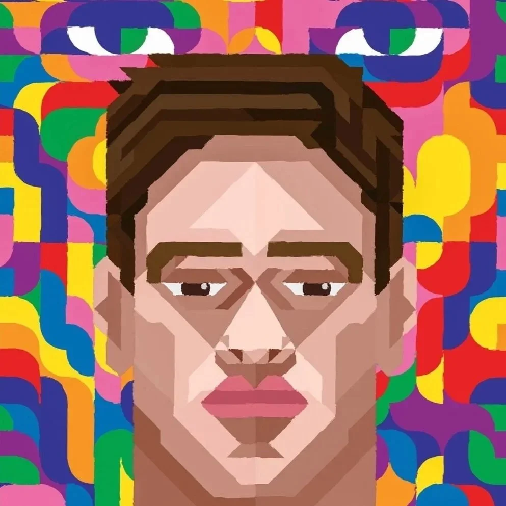
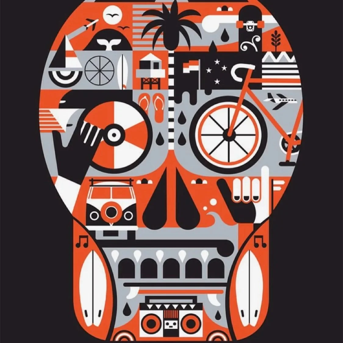
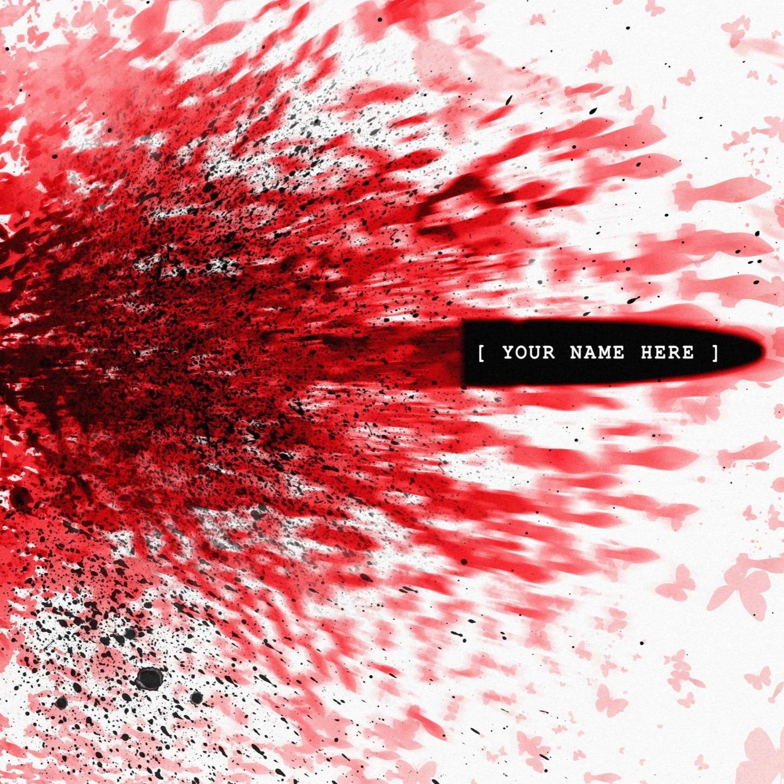
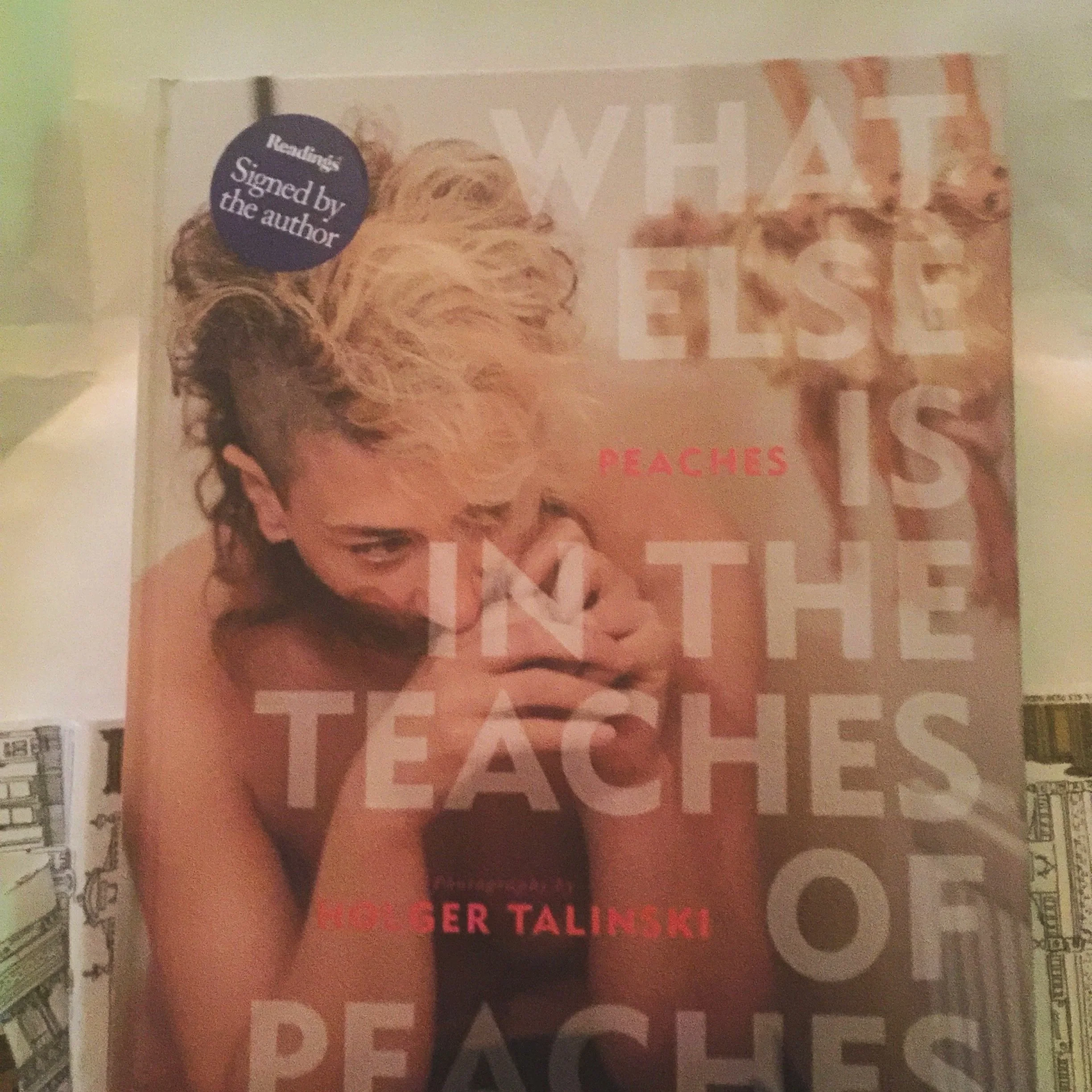
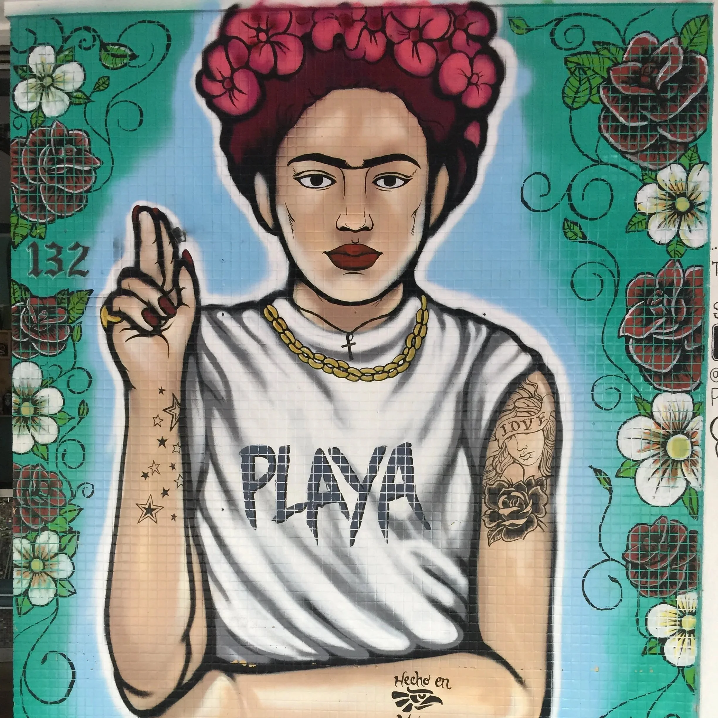
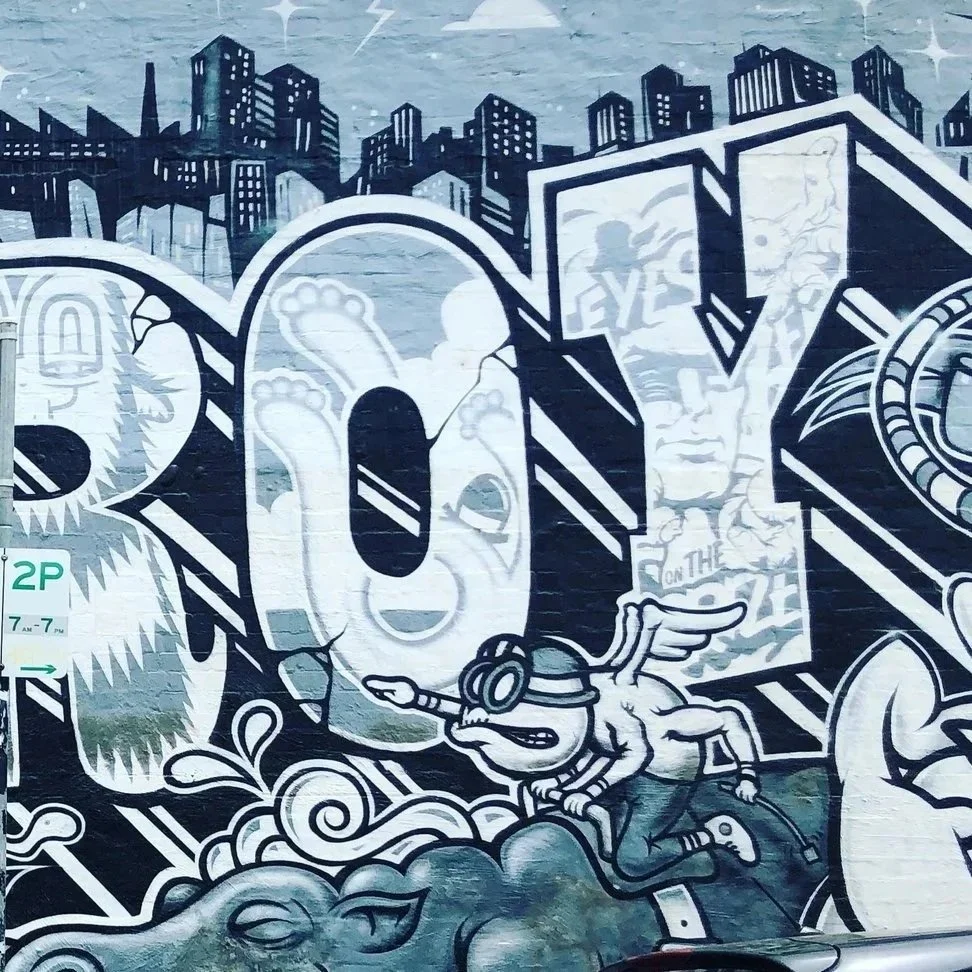
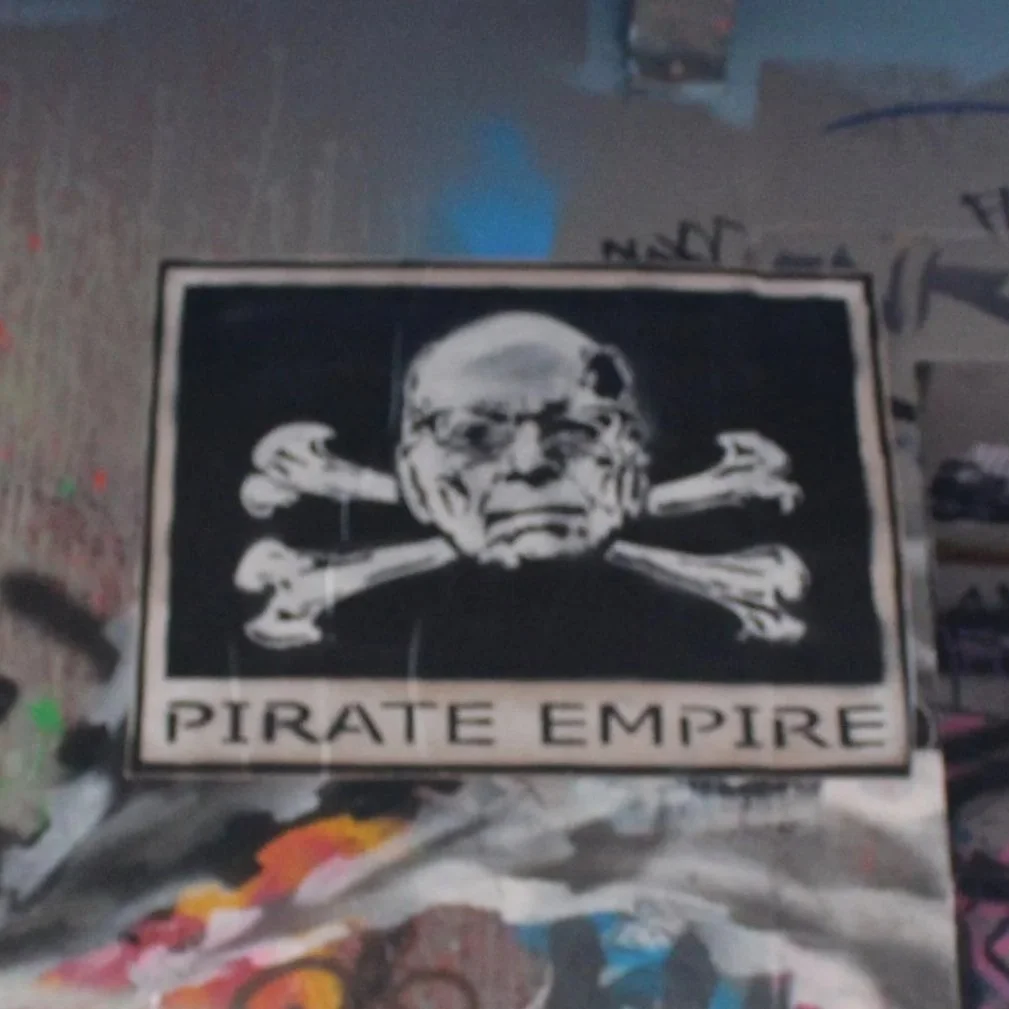
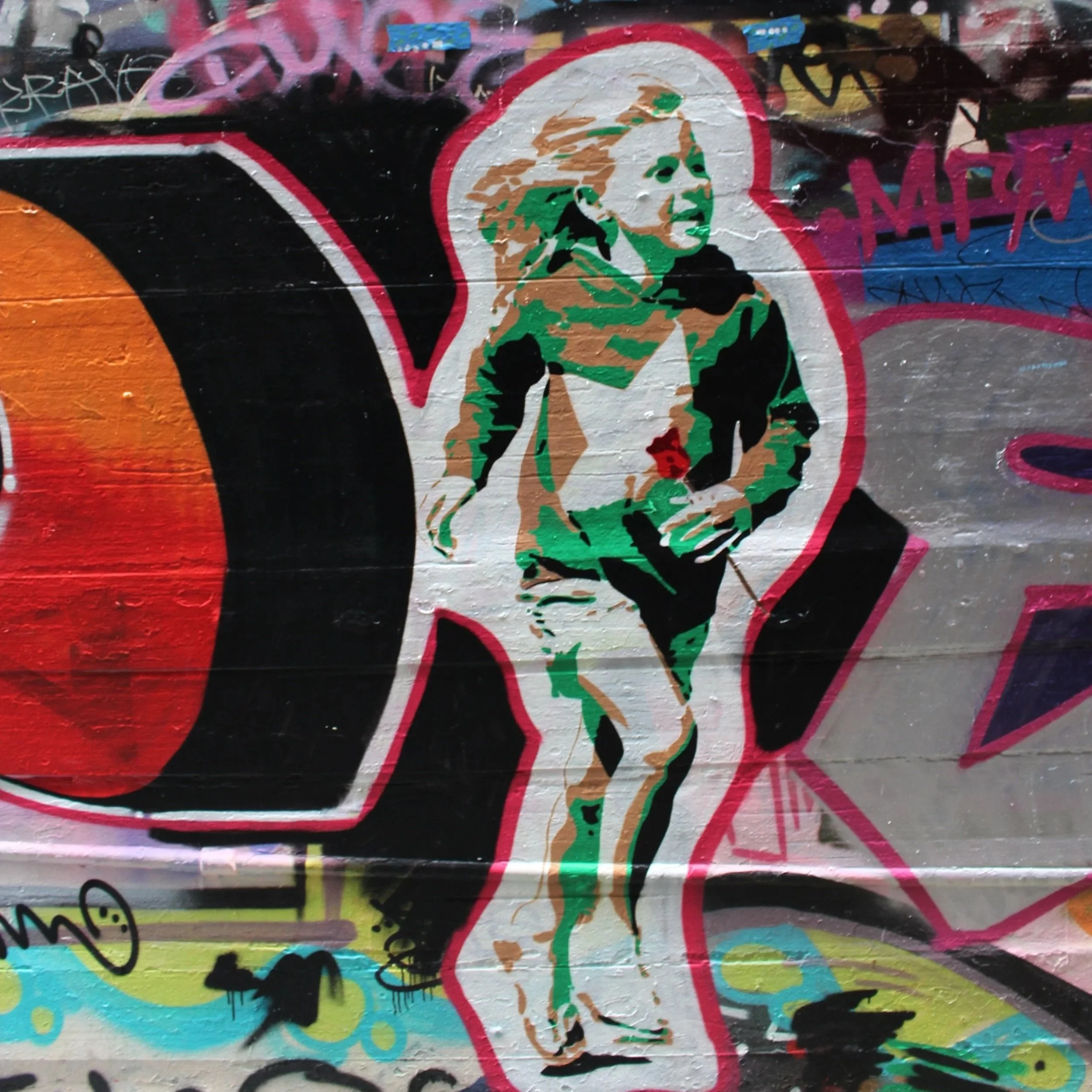
⬆[ random inspiration while putting this together. ]
Life Cycle explores existence not as a linear timeline, but as a closed, volatile feedback loop.
Life originates at the grip of the revolver, accelerating through its mechanical frame before exiting the muzzle as the catalyst of Death.
This impact punctures the core of the piece—a scarlet sphere that ruptures into a flock of butterflies, symbolising spiritual transience and a structural 'Big Bang.'
As this scattered energy drifts earthward, it reassembles into an organic architecture: a Tree of Life woven from DNA strands.
The genetic material eventually sheds like dandelion seeds into the wind, magnetically pulled back to the base of the handle where the cycle relentlessly restarts.
Strikingly, this is not a commentary on random street violence, gang crime, or everyday malice. Instead, it confronts the inherent, violent friction of existence itself.
On this exclusive Artist Proof, the text 'YOUR NAME HERE' serves as an interactive invitation: anyone who acquires a print from this edition is invited to replace that placeholder with their own name on the bullet.
By branding the projectile with your own name, the piece transforms into a deeply personal meditation—acknowledging that we are each the authors, the passengers, and the ultimate targets of our own cyclical journey through life and death.
4. The Process Drop
To connect with the theme of how art is shared and passed on, this phase pulls back the curtain on the anatomy of the graphic.
Next to the physical print, a clean QR code and link will drop the viewer straight into a dedicated digital studio archive.
The Mobile-First Breakdown
The archive features a dynamic, mobile-optimized process video that literally shows the artwork being torn apart and reconstructed, acting as a direct demonstration of technical skill.
Inside the archive, viewers can explore the raw mechanics behind the impact:
The Blueprint: Early wireframes, foundational character sketches, found art and collected material used for influence and use.
The Build: Video breakdowns showing exactly how hundreds of digital layers are built up and manipulated.
The Philosophy: A firsthand look at the method behind the madness—proving how that final "perfect, intentional chaos" is meticulously locked in.
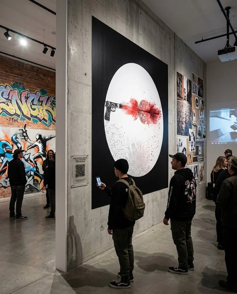
LOL Wishful thinking!Suggested* Display & Installation Specifications: Life Cycle
Dimensions: Large-format square presence, measuring $1000 mm x 1000 mm.
The Medium: Printed on ultra-premium, heavy-weight archival paper to maintain flawless high-contrast blacks and vibrant reds.
The Substrate: The print is securely stabilised within a dual-layer "sandwich" of 4.5 mm to 6 mm acrylic panels.
The Hardware Mounting System: The entire assembly is flush-mounted directly to the gallery wall using four heavy-duty, low-profile industrial signfix standoffs in a satin chrome or matte black finish, drilled directly through the corners to create a raw, "riveted" aesthetic.
The Luminescence: A LED edge-lighting track is integrated into a routed groove along the bottom edge of the panels.
The light travels through the edges, transforming the print into an illuminated centerpiece that throws a dramatic, theatrical hum across the artwork.
While Life Cycle is my main focus, my studio is packed with other completed, high-contrast works that fit the Roll Call 2.0 themes of documentation, dualism, and street culture perfectly.
I know space is at a premium for this show, but I’d love to pitch a couple of companion pieces for you to look at. I'm more than happy to leave the final choice up to you based on what best serves the room.
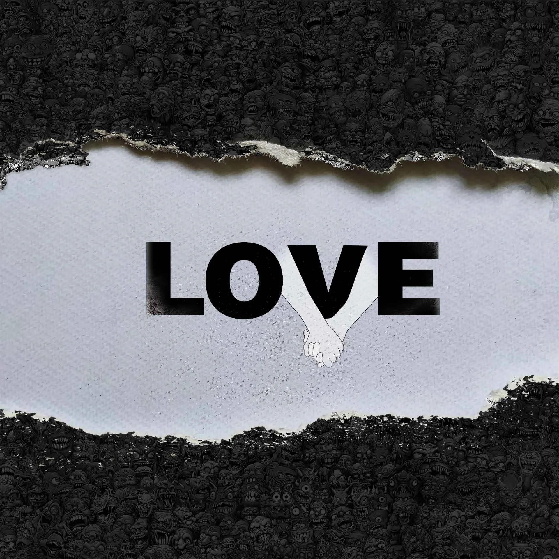
love breach
This piece relies on a strong, high-contrast visual idea you can understand in a split second.
The clean typography and central graphic of locked hands represent pure, human empathy, but they are dramatically sandwiched by a dense, chaotic border.
Look closer at that border, and it isn't just an abstract pattern—it is a crushing wall of modern trolls, online toxicity, and the hostile forces of society constantly trying to tear our love and human connection apart.
It captures a powerful, timely contrast: a desperate struggle to protect peace and empathy inside an overwhelmingly hostile and noisy digital age.
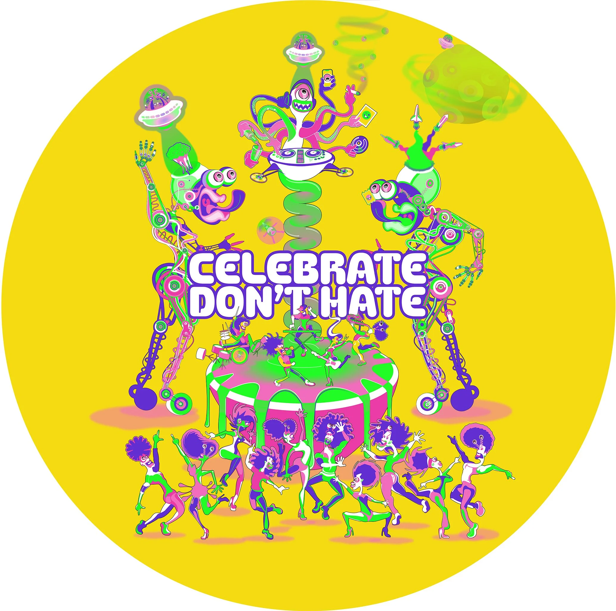
celebrate don’t hate
Tapping directly into the nostalgic, neon chaos of 90s warehouse party culture.
While it forces a wild, out-of-control world of custom multi-eyed aliens, spaceships, and psychedelic characters into a perfectly balanced, clean circular frame for instant visual impact, the real magic is in the crazy, microscopic detail.
It's an absolute maximalist puzzle where every single inch is packed with hidden, hand-curated layers.
It's a visual celebration designed to make you stop and stare, proving that even within a massive wall of chaotic data, everything can perfectly click into place.
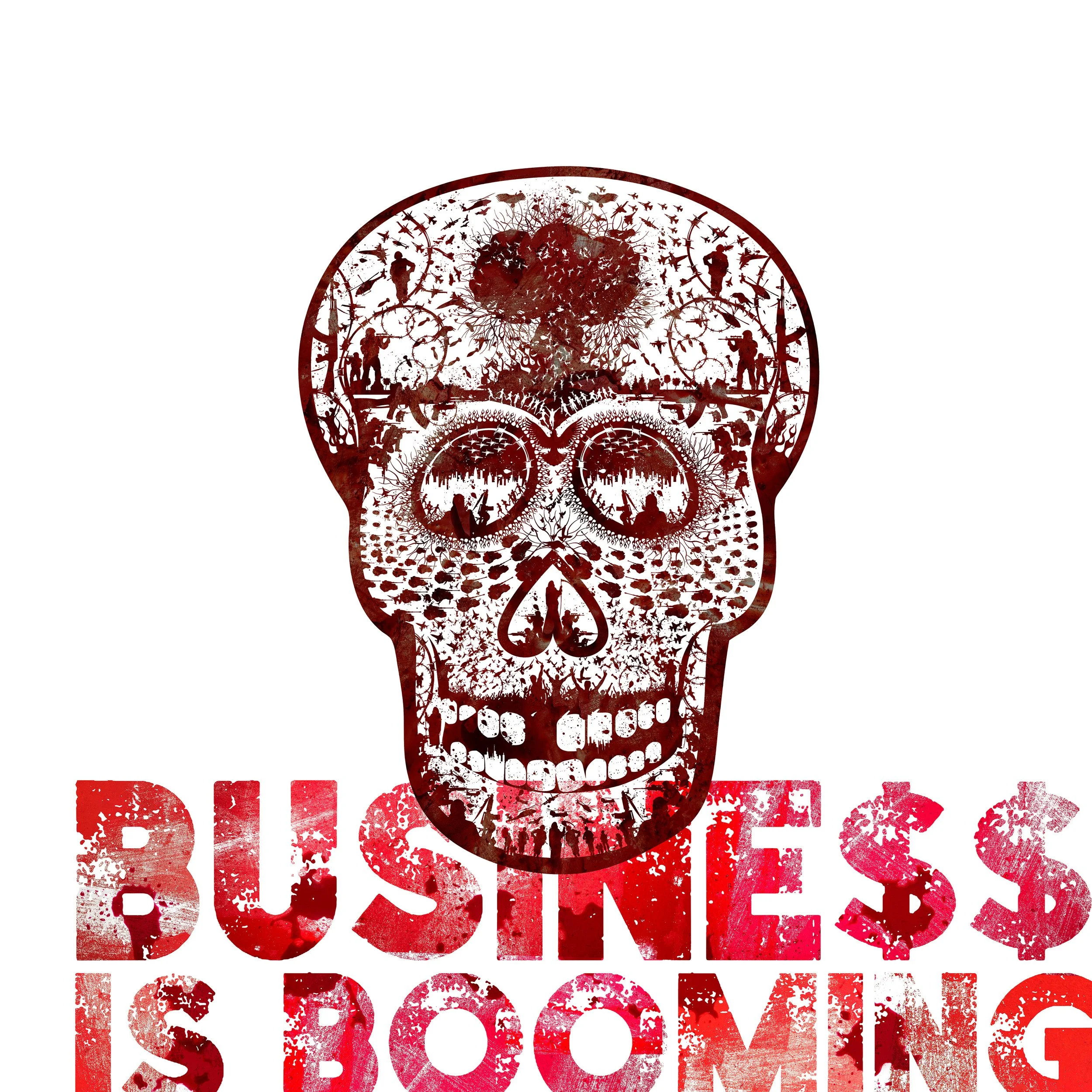
business is booming
A heavy, aggressive deep-dive into dualism that directly confronts our current global landscape.
Using the stark silhouette of a skull, the composition holds a chaotic, dense explosion of military imagery, silhouettes of conflict, and tactical vectors.
It is a high-contrast weaponization of corporate branding style, turning a sterile marketing aesthetic against itself. In a world currently dominated by war profiteering, constant geopolitical tension, and the desensitization of tragedy on our news feeds, the message is chillingly ripe for our times—exposing the dark reality where chaos and destruction are treated as just another profitable corporate quarterly report.
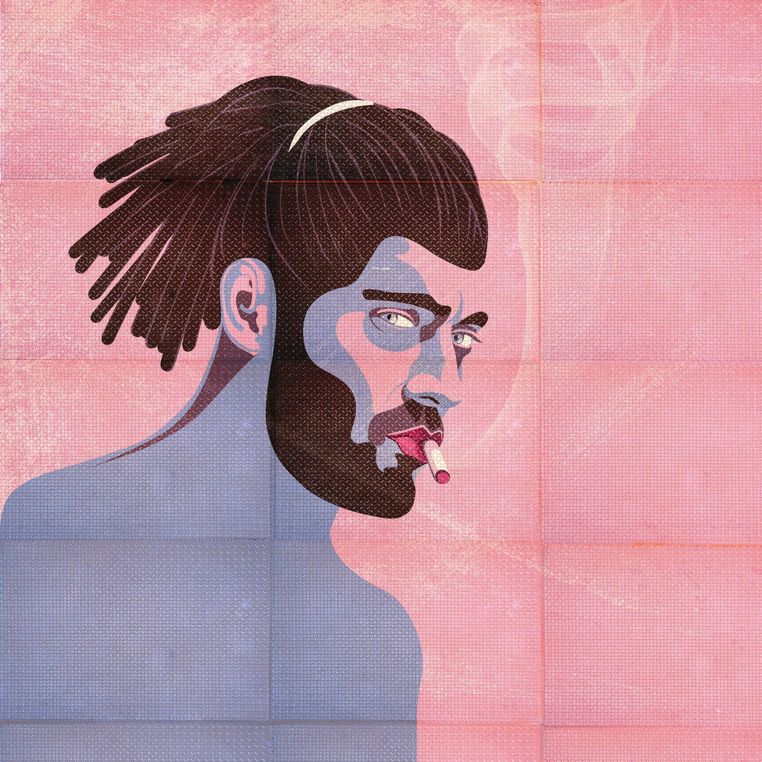
tough guy
Part of an ongoing series of portraits exploring the complexities of modern masculinity.
The piece subverts traditional "tough guy" tropes by wrapping the character in vibrant pastels, bright pinks, and neon tones, then smashing that graphic onto a tough, etched, and heavily textured background.
The addition of the cigarette serves as a classic nod to rebellion and coping mechanisms—a way of navigating the weight of the world.
It utilises detailed geometric shading patterns and a gritty, layered canvas to give this street-level character graphic a heavy, deeply textured physical presence.
I am completely open to collaborating with the curatorial team to select the exact visual energy that best fits the physical flow of the exhibition space.